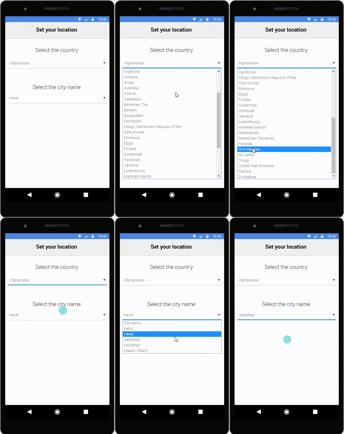
Select and Dropdowns show off a list of options (i.e. contents, navigation points) and allow users on selecting one of the options.
The problem
When using Select and Dropdowns, depending on the application can be a little bit annoying. If you have to set your location, for example, and have to choose your country, a big list of countries will be shown to the user, and you have to search for your country by scrolling down or up.
If you are using a smartphone, for example, is even harder because of the screen size limitation and your finger position, that can cover the information you need.


On the other hand, if you have to search in a small list, like the “City name” example above, the user will have no problem.
The recommendation
- Dropdowns items can be affected by context and should be organized considering it. For example, in a list of drugstores, the list should be ordered by proximity to the user. On other contexts, the list could be ordered by the most selected item or any other classification or rank that may be reasonable.
- Another solution for a large number of items is to split the list into two or more selects. This approach is not the best and many times cannot be meaningful, but it’s a valid one in some cases.
- A different approach to the dropdown situation with many items is to provide filters or categories in order to reduce the number of items displayed. This approach is already used on many examples found, however, it increases the number of clicks that the user needs to perform.
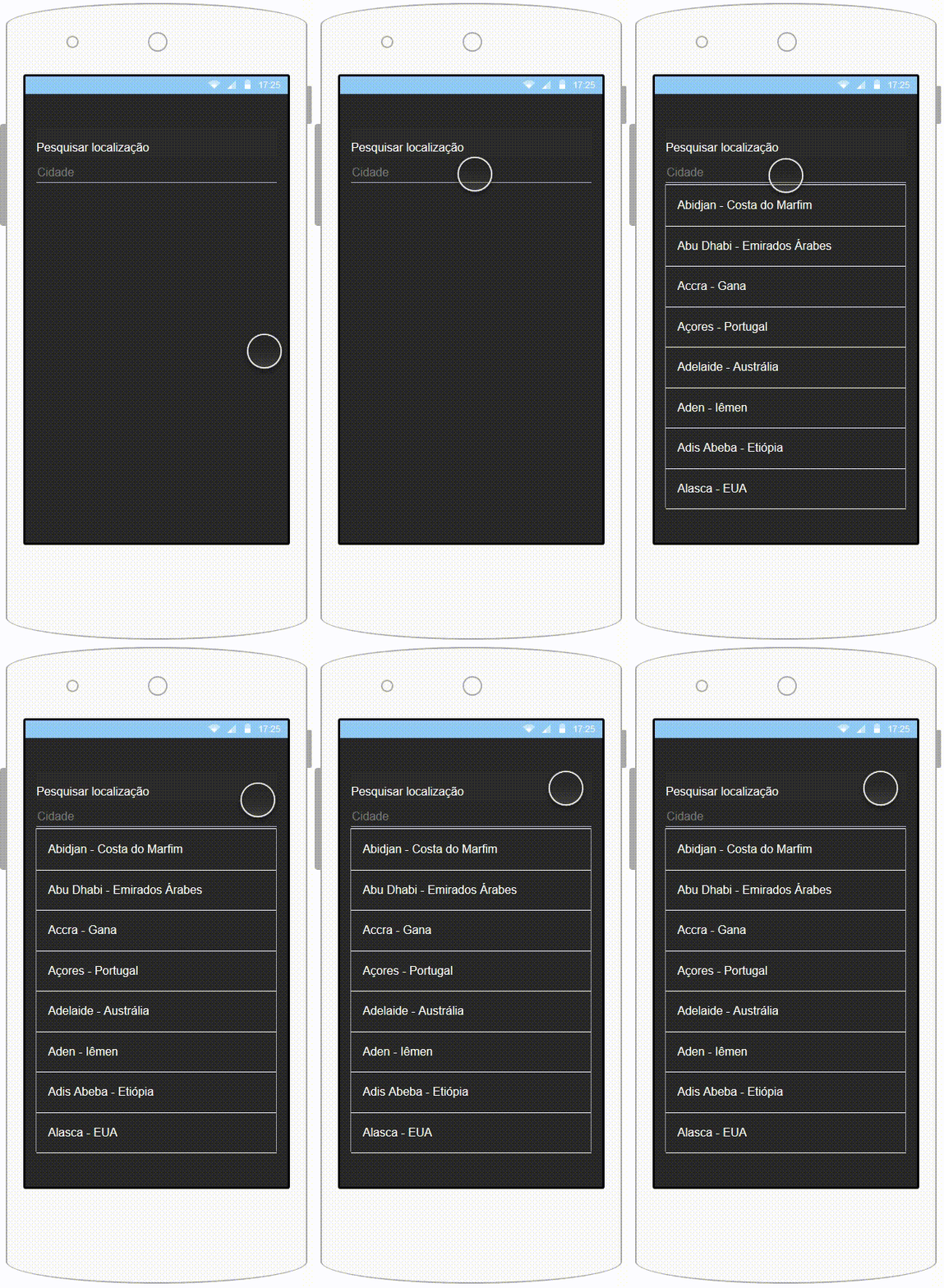
- One more approach to be taken is a hybrid search plus select implementation where the select box is also a search input and the user may type in order to filter the items. This approach is extremely valid as searching for the item may be faster than manually searching. One downside is that on mobile devices input entry may have complications for some users, due to the small screen.


