Input is widely used solely and in combination with other UIDP. Its main role is to make possible the insertion of data. We all had problems with input fields when using an application. Sometimes we forget what we are filling in… or is this a problem with the application?
The problem
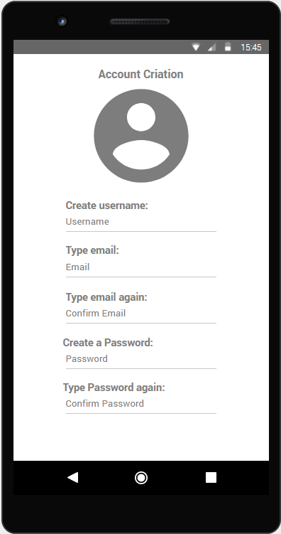
In addition to this problem, people normally use Placeholders to guide the users, but sometimes it’s not the best way to deal with it.
Placeholder is just a word in the text box that indicates the user what to type.


The use of placeholders alone saves the designer space for elements but disappears when the user starts typing, which instantly removes all the context of the input field. They usually are presented with low contrast to the background, which may spoil the experience of users with visual impairments or users with situational disabilities caused by screen reflection in the screen.
Besides that, when an input field does not have a label, the hit area of that element is reduced, and this can cause troubles to some kind of users.


The recommendation
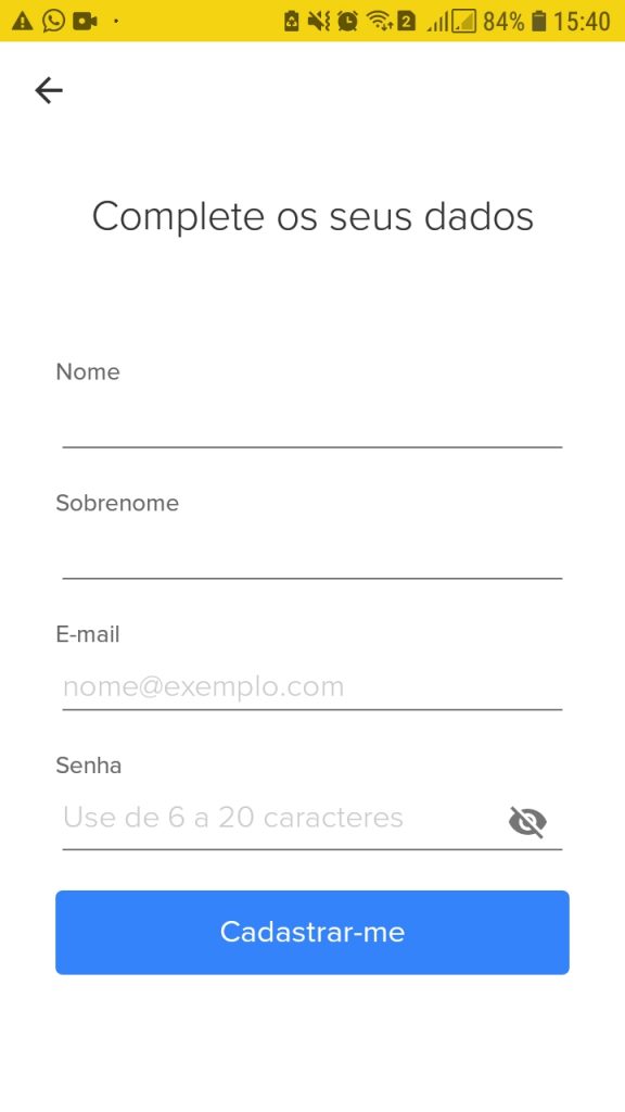
A solution to most of these problems is the appropriate use of label and placeholder together.
Labels have to be succinct, short and descriptive so that users can quickly identify what information is required. Also, they must present the necessary information for the user.
For example: on a login form where the user can use a username or an email to access the account, the label must contain “username or email”.
The image below shows the use of the label and the placeholder together:

Placeholder and Labels should never be in all caps, as it’s more difficult to read and harder to quickly scan.