
Hamburger menu is a kind of navigation interface design pattern mostly used on mobile applications that consist of presenting navigation options that are initially hidden and that can be triggered by the click of a button.
The problem
The problem with this approach is that the navigation is hidden from the user that needs to have previous knowledge to understand that the menu can be accessed by clicking a button. The menu icon has a low information scent, and, even with a label called ‘Menu‘, users may still not use the navigation as they do not know which options are available and don’t even click the button.
In the documents analysed by Vitor Casadei, several uses were presented about big companies that initially adopted the hamburger menu but soon changed it to Tab Navigation. Some companies as Facebook and BBC used the drawer navigation, but due to the low discoverability that this type of menu provides, they identified that users had problems locating sections and menu options.
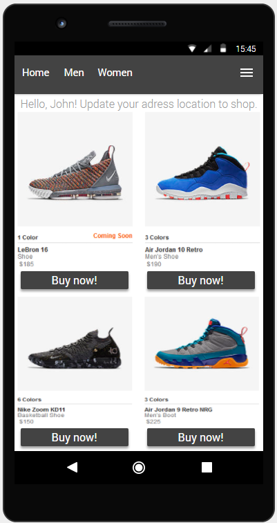
Here we are going to see an example where the hamburger is not in an appropriate form:

The recommendation
When dealing with patterns that directly affect the discovery of content, the solution is not always simple. However, some recommendations are effective:
• When using hamburger menu, use appropriate and explanatory terms for menu items;
• Avoid creating too many menu items. This can lead to an extensive list of options that are easily ignored and, sometimes, not well displayed on mobile devices.
• Although the menu is there, it’s positive to tell the users that what are the main navigation options available on the front page.


Now, we can see that the recommendations above were taken into consideration.