Featured

Overcoming Accessibility Barriers with User Interface Design Pattern for Mobile

What is Accessibility?

According to the ISO/IEC 25010 accessibility is defined as “the degree to which a product or system can be used by people with the widest range of features and capabilities to achieve a specific goal in a specific context of use”.

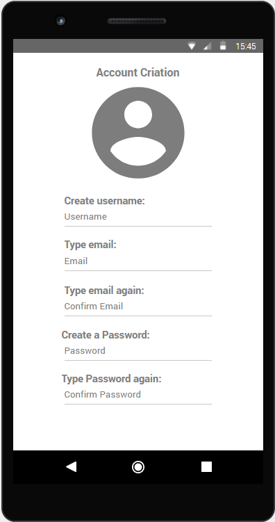
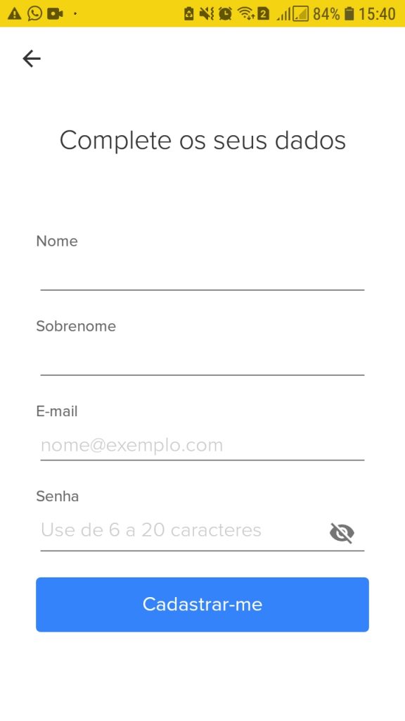
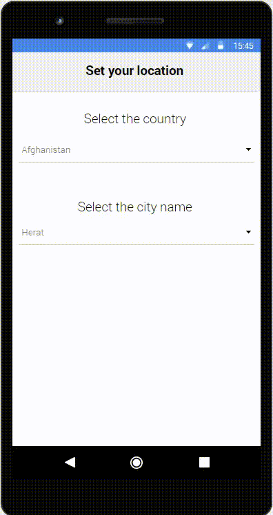
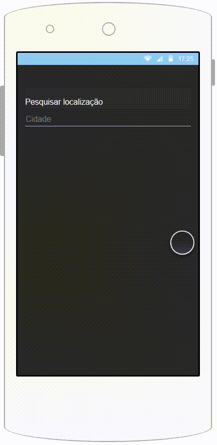
When dealing with complex processes on mobile applications, many times there is a big number of steps that the user must follow in order to complete a task or achieve a goal.

Although it may seem more organized and appropriate to split actions into various steps on multiple screens, this segmentation of information requires the memorization of previous actions. The problem is that people may struggle to remember previous actions or information! This problem can affect user independently of having or not diseases.

What is User Interface Design Pattern?

User Interface Design Pattern is a general and repeatable solution to a common user interface or interaction problem in the design of an interface. and consists of the following elements: pattern name, problem definition, solution, consequences, and examples. Software accessibility guidelines represent prescriptive knowledge in an abstract way and serve as recommendations of good practices that developers should follow.

giphy

Even users that do not suffer from any disability may have some difficulty following actions that are split in multiple screens when using the mobile device in busy environments where the user must be aware of its surroundings (in a bus, for example).

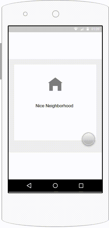
One simple but effective solution for improving the general navigation experience of users and provide accessible feedback to any user is to use breadcrumbs or hints of some sort that inform the current location. Although breadcrumbs are a common practice on web development, it’s rarely used on mobile.

breadcrumb-gif

With the information of the current location, users that often get lost on mobile applications will be able to understand better where they are. It’s important to find the appropriate place to display such information, as for example an action bar or a simple field above the page title.

AccessGuide Catalog

AccessGuide (Accessibility Guidelines) catalog was elaborated from an investigation on issues that developers and designers face by using User Interface Design Patterns in the development of mobile applications. These guidelines are organized by User Interface Design Patterns and focus on aiding developers/designers to use the UI mobile design patterns with conscious of the accessibility barriers.

See the catalog below.

AG-1: Hamburger Menu

Hamburger menu is a kind of navigation interface design pattern mostly used on mobile applications that consist of presenting navigation options that are initially hidden and that can be triggered by the click of a button.

The problem

The problem with this approach is that the navigation is hidden from the user that needs to have previous knowledge to understand that the menu can be accessed by clicking a button. The menu icon has a low information scent, and, even with a label called ‘Menu‘, users may still not use the navigation as they do not know which options are available and don’t even click the button.

In the documents analysed by Vitor Casadei, several uses were presented about big companies that initially adopted the hamburger menu but soon changed it to Tab Navigation. Some companies as Facebook and BBC used the drawer navigation, but due to the low discoverability that this type of menu provides, they identified that users had problems locating sections and menu options.

Here we are going to see an example where the hamburger is not in an appropriate form:

HamburgerMenu1

The recommendation

When dealing with patterns that directly affect the discovery of content, the solution is not always simple. However, some recommendations are effective:

• When using hamburger menu, use appropriate and explanatory terms for menu items;

• Avoid creating too many menu items. This can lead to an extensive list of options that are easily ignored and, sometimes, not well displayed on mobile devices.

• Although the menu is there, it’s positive to tell the users that what are the main navigation options available on the front page.

Now, we can see that the recommendations above were taken into consideration.

AG-2: Tab Navigation

Everyone loves Tab Navigation. Why? Because it’s simple, direct and fancy! It doesn’t hide navigation options. They can be avaliable all the time and the user has easy access to the navigation bar without needing to open a drawer, in order to locate wich navigations options are avaliable.

giphy

Besides that, another important contribution of the tab navigation is that the tabs communicate the user about the current location by visually featuring the current position in the related navigation option, and that is good also for people with cognitive decifiences, because its pure visual.

Cool, isn’t it? But how nothing is perfect, there is some kind of “problems” using this feature.

The problem

Thinking in mobile devices, we all know that the screen size have limitations, right? So, the Tab Navigation can hold up to 5 navigation options, in order to be able to fit in the screen, with appropriate font size.

tab_nav_again

The image above shows tab navigation with 6 navigation options, and, as you can see, there is information that is missing, like the hamburger menu and other products sections that are shown on the screen, like the backpack, for example.

The recommendation

• In cases where we have more than 5 navigations options, there are some approaches that we can do to solve this.

The first approach is to add the last option in the Navigation Tab called “MORE“, or another label that fits. By doing this, you keep the navigation tab clean and the user will not get lost because it will open a navigation drawer that will guide.

tab_nav2

• Now, the image above is showing the button “see more“, where you can see other products that are showing in the “Home Screen” (you can see that the “home” button is indicating where you are navigating) and now the hamburger menu is there too, where the user can see the account options.

The second approach applies the use of a horizontally scrollable navigation tab bar. By doing this, you are going to save some space without losing the pattern. The user is just going to scroll and search for what he wants to.

weather1

The downside of both approaches is that they still have discoverability issues.

AG-3: Icons

Everybody knows what is an icon, right? A simple button with an image or text. Icons make the application beautiful and easy for the users to navigate, but, sometimes, if used incorrectly, can cause confusion.

Icons are pictograph representations of something and are widely used in combination with UIDP. It carries meaning and its representation should be informative to users.

The problem

Sometimes, icons are not displayed correctly because the image or colour is not the best way to represent the meaning of it. This is a problem, because new users or users that have some kind of disease like colourblindness, for example, will have trouble using the application.

Some younger users don’t know or never saw a floppy disk, that is commonly used as a “save” icon. They just know it because all “save” icons are represented like it.

3d-model-of-the-save-icon

The recommendation

• It’s necessary to correctly choose meaningful icons that will actually help the user. One great way of doing this is choosing icons that are available in the mobile platform because it appears all the time when we are using an application, and it’s easy to associate the image with the meaning.

0 MqZQiPMgmDTNGEnD

• Always remember to put some text to explain what does the icon mean, because only an image, sometimes can cause confusion.

• Neutral colors are the best way to represent the icon too, because, most of the times, the color doesn’t mean anything, but for people that are colorblind can cause confusion if someone says, for example, “click in the red circle”. We can avoid that, right?

AG-4: Input

Input is widely used solely and in combination with other UIDP. Its main role is to make possible the insertion of data. We all had problems with input fields when using an application. Sometimes we forget what we are filling in… or is this a problem with the application?

The problem

In addition to this problem, people normally use Placeholders to guide the users, but sometimes it’s not the best way to deal with it.

Placeholder is just a word in the text box that indicates the user what to type.

placeholder

The use of placeholders alone saves the designer space for elements but disappears when the user starts typing, which instantly removes all the context of the input field. They usually are presented with low contrast to the background, which may spoil the experience of users with visual impairments or users with situational disabilities caused by screen reflection in the screen.

Besides that, when an input field does not have a label, the hit area of that element is reduced, and this can cause troubles to some kind of users.

The recommendation

A solution to most of these problems is the appropriate use of label and placeholder together.

Labels have to be succinct, short and descriptive so that users can quickly identify what information is required. Also, they must present the necessary information for the user.
For example: on a login form where the user can use a username or an email to access the account, the label must contain “username or email”.

The image below shows the use of the label and the placeholder together:

Account Creation

Placeholder and Labels should never be in all caps, as it’s more difficult to read and harder to quickly scan.

AG-5: Data Tables

Zoom in, zoom out, flip the phone… Argh!!! Data tables are always a problem when we have to visualize on the screen, but, in most of the times, is the best way to show the Data to users, and we can’t escape from it.

The problem

Data tables with a large amount of data in a form of a table are hard to be displayed for the user, even if they are using a computer. On a mobile device is even harder, because of the screen size limitation.

tabela1
tabela2

As you can see, the image on the left is showing us the content of the table, but you have to scroll to see the rest.

The image on the right shows us the full table, but it’s very small, and you have to zoom in to read.

The recommendation

  • Table borders are used by screen readers for identifying a data table. This means that if a screen reader finds a table that does not have defined borders, it will possibly parse the table as a layout table and will not read its contents correctly.
  • Some screen readers have difficulty identifying commonly used operands and characters usually used in data. One example is the use of hyphens to demonstrate negative numbers (for example -99.99). The screen reader will not read the hyphen in most cases, for this, it’s necessary to use the correct minus Unicode character.
  • On some framework implementations, tables are not defined with the usual <table> HTML tag, but defined with <div> or custom tags. With this, the screen reader will not be able to understand the content.
  • Data tables as any other content must have well defined ARIA attributes.
  • There are other issues with how to present a data table so that screen readers can read it that are presented on http://webaim.org/techniques/tables/data.

AG-6: List and Pagination

A UIDP that has been widely used for list navigation is the infinite list. In this pattern, the user does not have to click on any button in order to load more items, instead, when reaching the bottom of the page, a new set of results is automatically loaded and displayed to the user. This process continues until the end of the list is reached

On the web desktop, list navigation is usually implemented with pagination controls at the bottom or top of the page. This way, users have more control, like skipping, jumping, returning pages.

On mobile applications, an interface design pattern that has been widely used for list navigation is the infinite list, just like Facebook, where you scroll and the results are automatically loaded and displayed.

The problem

In situations of low bandwidth, which are common when using mobile devices outside a Wi-Fi network, the infinite list may present long waiting times while loading for new items to be displayed.

Another problem with the infinite list is that does not provide any information regarding the position on the list, where users can be easily lost, as you can see in the example below.

ezgif.com-video-to-gif

The recommendation

• Few controls to navigate should be available due to the small viewport.

• The negative point of using Pagination is that requires more clicks and actions from the user.

sem título

• It’s important to provide filtering and ordering options in order to lower the number of items in the list.

AG-7: Select and Dropdown

Select and Dropdowns show off a list of options (i.e. contents, navigation points) and allow users on selecting one of the options.

The problem

When using Select and Dropdowns, depending on the application can be a little bit annoying. If you have to set your location, for example, and have to choose your country, a big list of countries will be shown to the user, and you have to search for your country by scrolling down or up.

If you are using a smartphone, for example, is even harder because of the screen size limitation and your finger position, that can cover the information you need.

20181211_214006

On the other hand, if you have to search in a small list, like the “City name” example above, the user will have no problem.

The recommendation

  • Dropdowns items can be affected by context and should be organized considering it. For example, in a list of drugstores, the list should be ordered by proximity to the user. On other contexts, the list could be ordered by the most selected item or any other classification or rank that may be reasonable.
  • Another solution for a large number of items is to split the list into two or more selects. This approach is not the best and many times cannot be meaningful, but it’s a valid one in some cases.
  • A different approach to the dropdown situation with many items is to provide filters or categories in order to reduce the number of items displayed. This approach is already used on many examples found, however, it increases the number of clicks that the user needs to perform.
  • One more approach to be taken is a hybrid search plus select implementation where the select box is also a search input and the user may type in order to filter the items. This approach is extremely valid as searching for the item may be faster than manually searching. One downside is that on mobile devices input entry may have complications for some users, due to the small screen.

AG-8: Sliders

Sliders allow users to make selections from a range of values. In mobile applications, the slider is implemented by using touch screen interaction.

The problem

There are two possible implementations of sliders: the continuous and the discrete slider, and they have their pros and cons.

The continuous implementation of a slider gives the user more control over the selection range, however,  it’s difficult to select a specific value in the large interval. So, with a continuous slider, the precision may not be satisfactory.

Also, another issue that rises with continuous sliders is that the user has no idea of sizes and values that are currently available. This can lead to unwanted results.

20190121_175851

Another variation is the slider with two selections. In this implementation, the user may select using the same interval a lower and higher boundary for the filter, and the problem with this implementation is that in some cases when the range of values is too big, the user has trouble selecting a small interval, as the slider selection icons can be overlaid or cannot be possible to perform such action.

In the GIF below, we can see another problem using the slider, when the user can’t reach the number 4000.

The recommendation

• The values of the slider selection should appear above the pegs, with this, when the user clicks to select, the user’s fingers will not cover the value.

• There should be an alternative form of selection that is different from sliding a peg. This can be done by adding an input element on top of the slider, where the value can be manually changed by typing a new value or the value can be automatically changed when moving the selection along with the slider’s range. This option is useful for many disabled users with motor impairments and for those who use screen readers.

• In order to give the user more control over the selection, the slider could provide more information regarding the number of items available in a position. A way of implementing this is by dividing the slider positions by the number of items in a range. With this, a certain distance of movement on the sliders axis represents an equal absolute change in value.

• Another way of presenting the user with more information regarding the quantity of results, is to present a histogram based on the number of items in stock attached to the slider.

This is how your slider should look like in practice.

AG-9: Carousel

Carousel is used to show featured items with pictures and descriptions, but unfortunately, many mobile app implementations do not offer a satisfying carousel experience. In this pattern, the user is able to view several images across a row with a horizontal swipe to navigate from one item to another. Typically, an arrow indicates the direction of the carousel and apart from the featured item, there are other items partially hidden. Carousel is a typical pattern that shows the use of gestures to swipe and navigate through the carousel’s items on a mobile device.

The problem

Although the functioning of the carousel is intuitive, it is necessary to provide visual information regarding the direction of the carousel and also button alternatives for the swiping gesture.

The pattern works well on small devices because it uses screen space efficiently, but there are some implementations and variations that can cause accessibility issues.

20190124_010956
Here, we can see that the user can get lost, just because have no slider indicator.

The recommendations

• To avoid the overload of items, at the end of a carousel, it’s necessary to give the user the opportunity to see more results. A link named “See more” can be added and redirect the user to a page, listing more items.

• Some implementations present vertical scrolling that are not smooth. The scrolling of this pattern should regard the user with the option of fast and precise scrolling, without keeping the user stuck and limiting the user’s navigation.

• The implementation should always indicate the scrolling direction. Also, the carousel shall provide a unique starting point, presenting the far left item first.

• An infinite carousel makes the user tired and is not recommended. A good number of items can be from 8 to 20 items.

• A carousel does not replace any kind of list of items.

• It is important to maintain consistency in the item’s structure, so if one item has image and description, all items should have the same information. The items should also have meaningful images and descriptive texts in few words.

20190124_010227

And here is another correct way of representing a carousel: